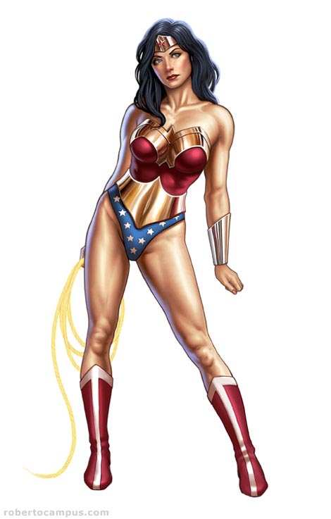
In this Photoshop tutorial I will show how I used Photoshop and a Wacom Tablet to create a digital illustration of a voluptuous Wonder Woman pin up. The tutorial reveals one of my digital painting techniques with a step by step walk through including images for each stage and layer settings. Enjoy!
Introduction:
Wonder Woman is an iconic figure in the comic book world. She is an amazon princess called “Diana” after a Greek goddess (Artemis). One of the most recognized characters in the pantheon (pardon the pun) of the DC Comics universe. Wonder Woman first appeared in the early 1940s and since then has been a favorite of millions of fans on comics, tv series (Linda Carter anyone?) and cartoons. I created this pieces as an homage to the character. I chose to paint her in a pin-up pose because I am also a big fan of the pin up genre and I loved the chance to portray Wonder Woman in a way that is seldom done.
Step 1 : Sketch

Photoshop Tutorial Wonder Woman Step 1 : Sketch
This is where your knowledge of anatomy and the human form come into play. The female body is especially hard to draw realistically, so for this sketch I shot some reference photos of a model. There is no shame in using reference, especially in the illustration field (where it is the norm). With the photos aside, I proceeded to draw the pose from scratch, paying attention to proportions, anatomy (you can see a hint of bone structure and muscles in my sketch). A good way to get good at drawing the female body is to draw from life and from photos as often as you can. Learn how each part correlates to the rest and what the proportions are in relation to arms, body, head, legs, etc. With practice it is possible to become very proficient.
Photoshop Technique: I created a new image. I left the background layer white. Added a new empty layer on top and renamed it “sketch”. I sketched the drawing on the “sketch” layer with a small brush with low opacity. To paint this sketch, I used Photoshop 7 and a Wacom Intuos tablet. My favorite tablet is the Wacom Intuos 3 6×8. See my tutorial on choosing the right graphic tablet.
Tip: While sketching, flip your drawing horizontally once in a while. It will help you find problem areas. Flipping your drawing might help you see where proportions are incorrect. Use Edit –> Transform –> Flip Horizontal.
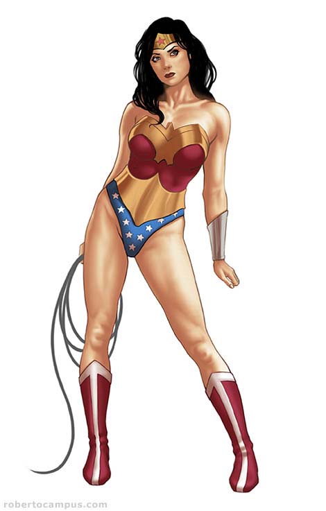
Step 2: Line Art

Photoshop Tutorial Wonder Woman Step 2 : Line Art
The goal of this step is to obtain a pretty good line art drawing. You can’t move to the next stage unless the line art is done properly. It will save you time and headaches later. I referenced Wonder Woman’s costume from several images I found on the web, but kinda changed it a bit to make it fit my vision for it. In other words, I made sure that our heroine would appear sexier and …ehmm.. well “stacked” as to say 🙂
Photoshop Technique: I added a new empty layer above the “sketch” layer and named it “line art”. I set the opacity of the “sketch” layer to 15% to make it barely visible. I then drew the finalized line art on the “line art” layer with a small brush. Once the line art drawing was finished I turned off the sketch layer.
Tip: At this stage is very useful to zoom in closer, at least 200%.
Step 3: Flats

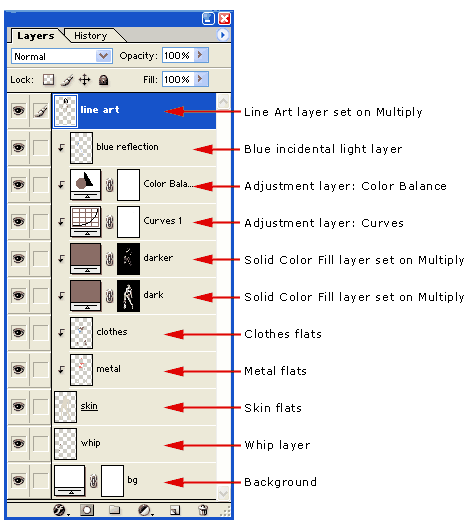
Flatting is a technique borrowed from the comic book industry. Each area is filled with the base color (skin, clothes, hair, etc.) to serve as a basis for the following coloring steps. Flats are essential when coloring comics especially and I like to use the same technique to paint digital illustrations. You will see later how having flats gives you great control over each part of the painting. Flats allow you to apply adjustments selectively to each part without touching the rest.
Photoshop Technique: I added a new layer under the line art layer and called it “skin”. I created a selection that covered the figure completely and filled it with a base skin color. Above this layer, I created another empty layer and called it “metal”. I proceeded to outline a selection of all the metal accessories on the body of Wonder Woman and filled it with a yellowish gold color. This will allow me to paint inside the metal parts only. I stacked this layer above the skin layer (hold the ALT key and click on the line between layers to do this). I did the same thing for the “clothes” layer. See the layer screen capture to see the layers at this point.
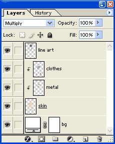
Tip: Instead of using the selection tool to define the flats area you can use the pen tool (press “P” on the keyboard). Lately, I have been using this method more and more often. It’s a bit slower but you end up with perfect shapes that very precisely follow the line art outlines.
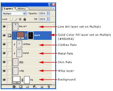
Step 4: Chiaroscuro (light and dark)
This is where the fun beings and the true power of this techniques shines! Photoshop 7 (or 6?) introduced adjustment layers and fill layers. To paint the shadows in, I use another trick borrowed from my comic coloring arsenal. Instead of actually painting directly on the flats, I paint in the mask of a fill layer set on multiply. This is extremely versatile because you can add, modify, smooth and paint as much as you want on this layer. Areas where the layer opacity is visible darkens whatever is on the layers below (in this case: skin, clothes and metal elements). It is easier to understand this technique if you refer to the layer setup screen shot. It is at this stage that my Wonder Woman’s voluptuous female body started to become more tri-dimensional.
Photoshop Technique: I created a new Fill layer (called “dark”) above the flats layers, but below the line art layer. I also stacked this layer inside the base flats layer “skin” so that this layer content’s would show only inside the area of the flat layer below. I set the “dark” layer mode to Multiply. Using a medium opacity smooth brush I painted in the shadows. I switched between the brush tool and the smudge tool continuously until I got the result I was looking for.
Tip: While you paint in a fill layer or an adjustment layer you are only actually working on the layer mask. Using white and black you define the layer opacity. White pixels are visible, black pixels are transparent. While you paint on this layer using the brush tool, you can use the “X” key shortcut on the keyboard to switch between black and white so you can add or remove opacity as needed. Also use the smudge tool often (“R” key shortcut) to blend in your brush strokes. This is a technique borrowed from my traditional oil painting background.
Step 5: Finalizing the chiaroscuro (darker shadows)
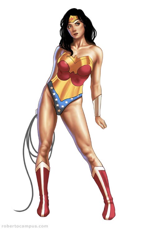
At this point it’s all about volume and shapes. My sexy Wonder Woman’s body needed darker areas to further refine her shapely curves 😉 Some areas needed highlights also.
Photoshop Technique: I created another Fill layer (called “darker”) above the original “dark” layer. I also stacked this layer inside the base “skin” flats layer. Again, the “darker” blending mode is set to Multiply. Here I painted additional shadows where needed. Using another layer for darker shadows gives me extra control. At this stage I also added 2 adjustment layers to enhance the figure’s contrast and saturation. First, I created a new Curves adjustment layer above the shadows layers and changed the curve profile so to add more red tones to the highlights and more blue in the darker areas. This simple step usually helps achieve a natural flesh tone look. I also added a Color Balance adjustment layer and did some additional tweaking. Finally, I added some incidental light highlights on the left side of the figure. To do this I added a new empty layer below the line art layer and painted a light blue halo near the edge using a smooth brush.
Tip: Adding incidental light usually helps enhance the tri-dimensionality of a figure considerably.
Step 6: Details
The final step is where the details and final adjustments are made. This is where I finalized her face, the metal elements and the whip.
Photoshop Technique: First, I linked all the layers (from the skin layer to the line art layer) and merged them together into a single layer. I duplicated this layer and then zoomed in to paint details using a medium opacity pressure sensitive brush with smooth edges. While painting, once again, I switched to the smudge tool to blend in brush strokes. To enhance the highlights I used the Dodge tool in small areas where a bright spot was needed. Use the dodge tool sparingly though.
Tip: It is sometimes useful to keep copies of earlier stages of a layer you are painting on, just in case you feel like the painting took a wrong turn and you want to go back to a previous stage.
Final Wonder Woman Pin Up:
Check out the final version of this image in my gallery where you can see her with a background.
If you liked this tutorial you might enjoy this link: Wonder Woman stuff
Nice quality – good job!
Eli!
Thanks for stopping by and leaving a comment. I checked your site and it looks very nice. A definite bookmark on my list.
Roberto
gooooooooooooooooooood!
Wow thanks for the tutorial Roberto!
Your work is amazing.
No problem, I added your site to the newest post on my site, email me if you want to link exchange too.
wow! thanks for sharing! this will really help me improve my works (some are not posted in my DA account).
hope u can share more.again thanks!!
Great tutorial, but how did you do the highlights? You explained about using black and white of the layer mask but the lights you can get it is the base skin colour underneath…
David: Thank you!
eman: That’s why I wrote it in the first place. So glad it helped.
Laggy: The highlights are areas where I did not apply any shadows. Also, I set the curves adjustment layer to bring out the highlights.
eli: Thanks so much for adding me to your list of Photoshop resources! I’ll link to your site in an upcoming post about cool Photoshop tutorial sites.
If only I could do that 😛
Love the comprehensive tutorial, but I love the artwork even more. The shading is especially awesome and detailed!
ps: May I know what brush settings do you use?
Wonderful and quite precise tutorial. I’ve read a lot of these and they usually seem too vague. You pointing out the layer hierarchy is exactly what I’ve been wanting to know all along. Your work is stunning. Glad to have found your blog. I’ll be watching it.
good!! i love wonder woman!
Kane: I used to tell myself the same thing some time ago 🙂 Thanks for stopping by.
Stoic: Thanks! For most of the painting process on this piece, I used a smooth round brush with 50% opacity. The brush opacity linked with the pen pressure. I varied the brush size when needed using the [ and ] shortcuts on the keyboard.
dopepope: Thanks for the kind words on my tutorial. I’ll be sure to make more for nice visitors like you 🙂
ihatedesign: Yes! She’s a hottie 🙂
[…] Campus Wonder Woman Tutorial Mándalo a tu Twitter: :: temas que pueden estar relacionados :: Un ejemplo en el […]
How helpful! I always wondered where to put incidental light. I like the basic block in by itself too, I think it’s interesting how a different artist might from there imagine the musculature differently. For me the clavicle and the knees are too developed, but I guess it’s more erotic that way 😉
Woot! Thanks so much for taking the time to put together a tute with such detail and sharing it with us!
Wow thats awesome work definitely got to try this.
wow, thanks man! very helpful! i have a question, its on the female anatomy. its kinda hard to eplain but, are the thighs the same sized as the rest of the leg or is it shorter? like…from the crotch to the knee, and from the knee to the foot…is it the same length?
Bueno tu trabajo, muy amable al espicar paso a paso, pero me parece muy complicada la tecnica que usas, se puede conseguir el mismo acabado usando simples capas, pero bueno es solo una opinion, Suerte
Amazing and very nice work.
coolest than anything else i have seen//…how can i download the full tutorial?
Roberto! Simply fantastic. My jaws dropped. Thanks.
very nice work
WOW. You have improved my coloring technique ten fold. Thank you so much for taking the time out to do this. I will never color the same again.
Hi Roberto,
I’m kind of new in this kind of colouring stuff but i like it verry much. So i tried it myself
But i have a problem and i wanted to know if i did something wrong.
For the ‘Flats’, for example clothes, i made a new layer and filled the parts with a colour ( with a brush ),
but after i do the ALT clicking thing to stack these layers above the skin layers, i can’t see the colours anymore. I only see my skin colour. So maybe i did the colouring all wrong or so. don’t know
Maybe you can help me
thanx
I think if I could choose to be a super hero I would choose wonder woman because she is super.
PS thank, JOB WELL DONE
Great tutorial,
You explained about using black and white of the layer mask but the lights you can get it is the base skin colour underneath…
Amazing…
it’s one of the best tutorial of photoshop.
[…] rato la Wacom y he aprovechado para poner en práctica una nueva técnica de coloreado que aprendí aquí. Muy cómoda y resultona aunque mi punto débil sigue siendo los matices de la […]
Hi!
I’m new to all this digital artwork and the wacom tablet and your tutorials have helped a ton! Thank you so much for taking the time to put them out here. Your work is super fantastic!
great job!
I enjoyed your tutorial. Now I’m planning to buy a tablet myself.:D
Thanks a lot!
OMG! now I know what to do! Tnx alot man! BIG HELP!
how do you draw a woman’s proportions?
God, a pretty good tutorial i must say
this was a real help to me… i’ll use it for my next works (yeah i color like crap)
Thank you for a great tut!
wow this looks great i admire the details good job and keep up the artistic abilties
^_^
exelente trabajo maestro……puede explicarlo en espanol? o usted conoce algun link con tutoriales en castellano? me refiero a Painter…gracias
This is amazing and too easy to learn.
can i do this with the mouse, or do i need the wacom?
a nice tutorial,high end detailing cooooooooooooooooooolllllllllllllll
wow..
i’ve been looking for a tutorial that help me to illustrate better..n i think i’ve found it..:))
nice details,,,nice tutorial,,very helpful,,n nice looking woman..hmm wish i had a body like that 😛
well done..!!
Wow, great job, and an excellent choice of subject matter (Wonder Woman).
Wow!
This is splendid.
I cannot speak English but I want to say that your ability is uncanny.
Please become happy.
Hi. I was wondering if you could help me a little. I followed all of the steps with ease except the incidental lighting. I don’t know why, but when I paint the blue areas it covers the female figure outline. I could always decrease brush size and do detailed strokes, but you mentioned just painting near the figure? Perhaps you’re painting beside the figure and using a glow affect? not sure.
thanks!
– alex
[…] ENLACE AL TUTORIAL […]
Heya, first let me say great tutorial, Im not really good with adobe and am learning with this tute.
Im on step 4. when u create the layer ‘dark’ theres 2 icons with a link between them. im stuck there. like do u select something with the Pen tool? how do u get to the black and white shadows where ur modifying the mask? using cs3.
side note: my wacom tablet seems to work fine in painter, but adobe does not pick up the sensetivity, any ideas?
ok, after much headache, i got it. i forgot to fill the ‘dark’ layer.
thanks a lot! this realy helped me
THANKS A LOT! ive been searching for this tute ,finaly found it ,realy helped me!
damnit cant i didnt get the light & darkning
the stacking part plz help!
hi roberto,
i’m writing to you to ask if is possible use your wonder woman like my avatar in a forum. please contact me.
tanks
PS: very good job!!
love your work! not only are you very talented but very inspirational as well! thank you!
questions…
1- in some of the steps you say to use a small brush at a low opacity…i use a wacom tablet and was wondering if it would be the same to set the opacity and flow to 100% and just control the opacity with amount of pressure i use as i am painting
2- where are you getting your colors? and once you choose your colors how are you going about picking colors a little darker and lighter? just picking them by feel? im asking because another tutorial im playing around with out of photoshop magazine is saying to lay the flats out and then dodge and burn the shadows and darks….but i like your finished piece alot better then theirs…
by the way…thank you very much for taking time out to offer advice and help to us all!!!
Hi Roberto,
thank you for your tutorial. I’m trying to learn to use the digital tools for my art, and you have been a great help in learning despite the fact, that I’m poor to read any instructions. My favourite learning method is try and fail 🙂
very useful tutorial, i’ve tried all your tutorials already, please post some more… i am hungry.
very very good job! your tutorial will help me. thanks a lot. its good please give me advise if required in future.
Brilliant Work done with reative mind
Hi Roberto,
Awesome! I have one question though. For your ‘dark’ and ‘darker’ fill layers…you use a darker skin color. Does that mean that even when shadowing parts of the figure such as the armour and shoes which arent skin colored, the shadow will have a skin colored tinge to it??
this is pretty awesome!
definitly gonna try it….
thanks for the tutorial
Your art is fantastic, so fantastic that I’m using this tutorial as an analogy in my Critical Thinking class. It’s not going to be shown other than to my classmates, but I thought I would let you know just in case.
Sabes Roberto yo estudie pintura hace muchos años figura humana, clarooscuro, oleo, crayon pastel y domine todas las tecnicas de pintura artistica, pero por razones de familia tuve que dedicarme a trabajar para darle de comer a mis hijos, pero en los ultimos años, me dedique a darle vida a una empresa de serigrafia, pero como comprenderas en mi pais (Guatemala) se copia mucho, y me dedique a investigar como podria hacer para explotar todas mis habilidades en computacion y asi hacer diseño original, pero nunca me imagine la gran calidad que se logra, lo unico es que no tengo tabla Wacom ya que aqui en guatemala no hay un distribuidor.
En verdad que es imprtesionante esa gran calidad que logras y ahora solo en tu pagina me la paso para poder lograr algo de esa gran calidad te felicito sinceramente y no se como puedo hacer para comprar una wacom.
sALUDOS
anibal barillas
indinesandree@gmail.com
Me parece fantastico lo que logras con photoshop, sabes hace algunos años estudie pintura artistica, oleo, clarooscuro, pastel etc, y llegue a tener cierto reconocimiento, pero por razones personales no continue, ahora tengo una serigrafia y como sabras en paises como el mio (guatemala) no hay desarrollo a este nivel por lo que uno tiende a copiar lo que viene, nunca me imagine que con photosho y la tabla WACOM se pudiera lograr semejante calidad, ahora mi pregunta es como puedo hacer para lograr a desarrollar este pontencial que ten go en dominio artistico, y tener esa calidad y logra hacer producto original en mi pais, por cierto aqui no hay tablas como puedo hacer para comprar una y cual me recomienda,,
saludos
Me quedo admirado de esa gran calidad…..
[…] learn how to covert the pencil sketch into an awesome digital art with realistic color. Enjoy ! Read Complete Tutorial Here Tagged as: coloring, digital drawing, drawing Email this author | All posts by […]
[…] Wonder Woman Pin Up Digital Painting […]
Exellent tutorial, do you speak spanish?
You did a great job i got it right away they!!
–keep it up–
your work is amazing my friend. I am not good in photoshop, thank you for this tutorial! 🙂
Amazing! Thank you for showing your art skill.
This is really great. I’ve been going over it and over it, trying to come up with something half as good as your result. 🙂
Cool… Easy! Just last SnapShot of Layer was enough to learn 🙂
Awesome tutorial! You just increased my colouring technique ten fold! Kudos!
WOW. Your website is exactly what I have been looking for for the last 2 years! It’s only thru stumbleupon i found it! Thank you so much for not just showing me step by step how you did it, but not forgetting to post the photoshop technique you used to achieve it. That is what is usually always missing in digital painting tuts that I have found. I am a beginner but your method has pointed me in a direction that I feel now confident to begin traveling. Thank you.
Like some the above I would like to express my gratitude to you for taking the time to do this. Great Stuff! Great work. Thank you.
What would be really helpful to me is to have the line art layer available so that I can follow along with what you are saying to do. It would save me some time anyway. I learn better by follow what is being done. I am not an artist per se but I am trying to learn to be better than I currently am. I currently have the Wacom intuos 3 12×12, painter X and Photoshop (Windows based system).
Other than that great tutorial and great version of WW.
Great tutorial Robert!!! Although I have always loved drawing (the old fashion way – pencil and paper), I am trying to learn Photoshop – this tutorial is a great learning tool!!! I know very little about the finer points of painting with the various brushes/tools/etc. in the program, but it seems very interesting. Again, a very well done piece of a classic DC comic character!! Thanks again!
[…] Wonder Woman Pin Up Digital Painting In this Photoshop tutorial they will show how to use Photoshop and a Wacom Tablet to create a digital illustration of a voluptuous Wonder Woman pin up. […]
[…] Wonder Woman Pin Up […]
[…] Wonder Woman Pin Up Digital Painting […]
i saw this work and its outclass ….realy its a great work done by u…….
absolutely stunning i dont think an animated picture has me so turned on lol
very nice…..Wonder……..
The Art of Roberto Campus » Blog Archive » Photoshop Tutorial: Wonder Woman Pin Up Digital Painting…
The Art of Roberto Campus » Blog Archive » Photoshop Tutorial: Wonder Woman Pin Up Digital Painting…
Gorgeous
This is awesome. I love this tutorial very much. Try my site
[http://photoshop-great-tutorials.blogspot.com/] for
some more great tutorials.
[…] Wonder Woman Pin Up Digital Painting […]
DARN YOU’RE GREAT!
Okay, after messing around some more with this technique I have finally figured it out and now, even more than before, just don’t understand why anyone would approach it this way. I would advise anyone who is just starting out to avoid this method simply because I believe it would be better to actually paint using color rather than “tricks” with layers. That’s cool to do this method AFTER you’ve mastered painting in a more traditional manor but I have seen tons of fantastic Photoshop paintings where the artist used only one or two layers and actually painted it rather than use a bunch of clipping mask layers and other tricks. The end result is fine (don’t care for the black outline-takes away from the realism IMO) but I think a PS artist should use a brush and colors. Hope this didn’t come out rude because it is great and the artist is obviously very talented but I think this method takes away from learning about color and how to go about picking them.
Well, I need to apologize. After thinking about my post I felt a little bad and thought I came off too harsh. I never meant to sound like that tis method was awful or “wrong” (there is no wrong way to do art of course) but I was wrong in my approach to my comments. I have been doing this tutorial for the last hour now and realize that it’s actually pretty clever AND a good way to do it. I know, I sound like an idiot…a crazy person and no I am not drunk : ) just was frustrated at first and had a knee jerk reaction. I do still think its a good idea to learn how to achieve this same look by more traditional methods but there isn’t anything wrong with this way either so I am sorry for spouting off too soon! Keep up the good work!
OFD: Thank you for you comment and for taking the time to try out the method explained in the tutorial. Photoshop is a great tool, and there are almost infinite ways to get the job done. The tutorial presents a technique that I borrowed from my work in the comic book industry. It’s an approach I evolved from coloring comic book pages professionally, taking the base method and adding more complexity to it. Over time, I figured ways to use flats and layers to get a “painted” look. It is my favorite way at the moment to color using photoshop. Colorists regularly use “flats” as in this tutorials to color the line art. Normally, a colorist using the manga/anime style would only apply a base color and then shadows (usually of 1 or maybe 2 intensities, plus a layer of highlights). Coloring comic book pages comes with crazy deadlines, sometimes requiring a colorist to get 20 pages done in less than a week. Using flats and multiply layers gets the job done much easier (10 times faster), than having to paint and pick colors. Colors and shadows have to be consistent through each scene, and having everything on their own layers offers great flexibility and a degree of control otherwise not achievable. Having everything on layers is also (but not always) a requirement on how the art needs to be delivered, so the art directors can make changes easily.
Your Wonder Woman tutorial is very informative. But, how do I stack a layer inside of another layer?
You have BEST tutorials ever Roberto. And immortal artwork. Thx for help and inspiration
Thanks for the tutorial. I’ve got a couple of pieces that have been giving me fits–I’ll try it your way and see what happens. Beautiful work, Roberto!
your work is amazing roberto..
but is so dificulty for me..
if can you show detail step by step,,
thx …
good job…
I’m tried this but im completely at loss in step 4. I dont understand what i must do.
wohhoo…Excellent Roberto! thanks for the tips about expanding my knowledge using Photoshop combination with my knowledge in visual arts..Actually, i’m a visual artists from Philippines and knows only the basic functions of Photoshop..many many thank you..
I hope can draw one like yours!! If I can, I’ll post it here!! Thanks!!
Thanx Robert. Your tutorial give me some perspective to draw with Corel Photopaint. Your work is awesome.
Thanks so much for sharing your wonderful work. Love your process.
Matt
Excellent …Very nice….
(I dont know how to give skin colour like that.I can draw only.I want to give rough skin for a dinosaur.I dont know how to do it…)
[…] Wonder Woman Pin Up […]
Wow, AMAZING! Thank you Roberto and I hope you bring us more tutorials like this one!
Hi,
Roberto i liked your work very much but it is bit difficult for me to understand by this method,can you make a video of this tutorial and post it here so it’s easy to understand.Thanks waiting for reply
I’m not sure if you’re still checking comments, but I had a question about the curves layer you place during the process of finalizing chiaroscuro. I’ve been fiddling around with the graphs in that layer, but I’m not sure how to really cause the changes you mention (tinting highlights red, shadows blue, etc.). Is the process supposed to also affect the other layers (in your case metal/clothes)? Finally, do you have any recommendations on using this process to color dark to black materials such as latex/leather? Thank you.
[…] done 100% on the tablet. I present to you my version of Wonder Woman. I’ll be following this tutorial for digital coloring in one of the coming weeks. I’m looking forward to that part. I think it will be much […]
Roberto, Just wanted to add my thanks to your comments.. This has helped me organize, sped up my painting time, and allowed me to make changes so easily! Thanks so much for your efforts in this easy-to-follow tutorial! You absolutely rock.
Hi. First, great work. Love it. But: The 4th step doesnt work for me, doesnt matter what i do. Even if i copy the third picture of yours in my photoshop with just the flats, apply the fill layer with #9e685a and start painting with brushes doesnt matter what opacity and stuff, my girl always looks like dirty, pink and brown, and not orange skin like, like on your 4th picture(light and dark). I’ve read the tutorial about 30 times. Did i, or you, miss a step?
=o
Amazing tutorial and job!!!
I really see this technique quick and easy and the result is cool…
I try every style of painting in my drawings… but I’m still undecided about what to do… sorry for my bad bad english ú_ù
You have beautiful works!! congratulations!
a milion thannks for the time put in to do this
[…] In this Photoshop tutorial I will show how I used Photoshop and a Wacom Tablet to create a digital illustration of a voluptuous Wonder Woman pin up. The tutorial reveals one of my digital painting techniques with a step by step walk through including images for each stage and layer settings. Enjoy! Read this tutorial >> […]
very nice and sexy digital painting
thnx good painting
Great work 🙂 Thanks a lot for the tutorial it helped me a lot
Hey, do you have it in PDF format to download?
[…] Wonder Woman Pin up Digital Painting […]
well done buddy … great tutorial .. thanks for share .. now i am trying to make this ..
first i’d like to say…AWESOME!! not only are your skills and talents second to none, but youre an awesome person to take time away from your busy schedule and life to help so many others, and from what i can tell, it all comes from your passion and and dedication to art and life, im sure among many other factors and sources-thank you Roberto, you are a great example/role model in life as well as teacher in art, and one can gain alot from allowing himself to be influenced by you and your presence, taking the opportunity to enjoy in full, wonderful things i consider to be gifts from God-thankx! :o)
i have a very broad yet specific Q-
how do you know when youre done? how can we (as we grow and practice and gain skill/experience) do we train ourselves to see where we are at in our project/art-piece, and see what is not there, knowing that “it” is missing? i can get to around to about 3/4 of your tutorials no problem and feel so certain im done and it looks great/solid etc…go back to it later, compare it to yours and see where you added just a tiny bit which in turns looks like you added SOOO very much more…little details or blue highlights, maybe highlights or shimmers on metal or wet lips/eyes, etc… that seem to put your work over the top, where when im on my own i see the phase just right before and it looks so “done” and solid…ill bet every original piece i have of my own you could see what im missing and add these “finishing touches” and my art would change and reach a whole new level…how do i get there… where i “see” where the last “steps” arent there and to finish? and btw-i do little finishing touches with blue highlights, wet/moist lips n eyes etc…and somehow my final stages all fall around your 3/4 to about 7/8 stages of your work…please explain/help!
Wow, incredible stuff. Thanks for this excellent step by step of a beautiful piece.
[…] by Brandon I’ve been thinking about doing a Wonder Woman pinup, and during some of my research I came accross this beautiful piece by Roberto Campus, he’s also put up a step by step process of the digital painting which is fun to read. Check it out here: https://www.robertocampus.com/2007/06/photoshop-tutorial-wonder-woman-pin-up-digital-painting/ […]
WHERE CAN I FIND GOOD VIDEO TUTORIALS AND WHAT ADVICE DO U HAVE ON USING THE BAMBOO FUN IS THT GOOD FOR DRAWING REALISTICALLY IM LOST I HAVE NO IDEA HOW TO USE THEESE TABLETS PLZ GET BACK AT ME DAYMION.BONNER@NAVY.MIL
Fantastic tutorial, i’ve been a fan of comic book art for many years. I tried researching how it was created in an attempt to give it a try myself but i always found free tutorials to come accross as being deliberately vague when it came to the sepcific settings and techniques. This is certainly not the case here. I’m not sure if you still check these posts, but i have a question regarding the line art step of the image.
So, in the off chance that you do see this; how do you use to create the line art? I always seem to end up with another ‘sketch’, this might be due to my usual drawing technique, but i was wondering what specific brush shape/size/opacity and whatnot you use for this stage. Also what is the drawing technique behind it, is it a slow and careful process, i’m not great at outlining; my lines always turn out a little bit rougher than i would ideally want. If you could help me out with any tips or advice that would be great. Your artwork is brilliant, hopefully i’ll pick it up eventually.
Jake
could u make a video tutorial with it?
the whole procedure is difficult for some to follow only by words.
thank u.
wow, great tutorial, thanx for this 😀
Wow, great tutorial, thanx for share 🙂
Your blog is really helpful for photoshop tutorial & lots of tips!
many many thanks for sharing this nice post!
[…] me he puesto a practicar sobre el tutorial del otro dÃa, el de coloreado sobre colores planos de Roberto Campus. He de decir que me he quedado bastante flipado, porque la técnica permite colorear una […]
[…] Project Wonder Woman Image by apoloduvalis colour pencil drawing on white cardboard 70cm x 140cm based upon an original work by Roberto Campus http://www.robertocampus.com/2007/06/photoshop-tutorial-wonder-w… […]
[…] 40 • Tutorial de Photoshop de pintura digital de "La mujer Maravilla" […]
It was a good resource article, the only thing I could not get past… and this is completely nit picking, I know but I surely doubt Wonder Woman would ever stand/pose like a Valley Girl.
[…] Wonder Woman […]
[…] Wonder Woman Pin up Digital Painting […]
The photoshop tutorial about painting Wonder Women is so cool!The photoshop tutorial about painting Wonder Women is so cool! 😉
Step 4 is very strange. As soon as you Multiply, it puts in the shadow selection over the entire selection, so are you working backwards? Meaning, you remove the dark from the selection, thereby leaving the darker tones behind? If so, that seems really funky. I tried it and finally gave up after a few hours. I prefer to paint the shadows and highlights, not extract shadows and flats to get to the same effect, but if it works for others, I guess great…I think I’ll keep shopping for a different technique.
It’s amazing! Thank you for sharing..
Great tutorial, you can also check digital painting using masks and paths for people who don’t own a tablet.
[…] Project Wonder Woman Image by apoloduvalis colour pencil drawing on white cardboard 70cm x 140cm based upon an original work by Roberto Campus http://www.robertocampus.com/2007/06/photoshop-tutorial-wonder-w… […]
Ótimo tutorial, valeu pela ajuda, vc manda muito bem!!
[…] Photoshop Tutorial: Wonder Woman Pin Up Digital Painting […]
[…] featured below:Dianae Digital Painting TutorialZombie Portrait in PhotoshopColouring in PhotoshopWonder Woman Pin Up Digital Painting TutorialComplete Digital Painting TutorialHow to Draw a Portrait in PhotoshopKikisaurus Digital Painting […]
[…] Wonder Woman Pin Up Digital Painting Tutorial […]
fine as hell
The simple art to create superb digital images is great. Thank you for demonstrating the techniques.
Chandra Mohan
[…] Wonder Woman Pin Up Digital Painting […]
Nice work! I have come across this a few times and have used your techniques for the shading as well as sharing it with others.
Thanks for sharing it with us!
Christie
Olá Roberto ! Eu me chamo Débora e sou do Brasil. Em uma procura de imagens sobre mulher maravilha encontrei essa imagem e seu nome. Fiquei impressionada com o seu trabalho e gostei tanto da imagem que quero fazer uma tatoo dessa imagem. Se eu fizer, mando pra você a imagem, ok. Espero que fique tão bonita quanto a sua imagem.
[…] Wonder Woman Pin Up Digital Painting Tutorial […]
WOW! I came here from the Spoongraphics blog and I can’t leave without leaving a comment. The final result is simply awesome, the details and the shading are marvelous and it reminds me a little bit to these illustrated 80’s movie posters (like Conan or something http://is.gd/Cb5Jmp).
Stuning work, I really really like it. Cheers.
Outstanding work, and solid instruction. Makes it very accessible and understandable. Thank you!
[…] the paint, I used a technique described in this tutorial… I had to make a couple changes because I used Painter12 instead of Photoshop. Painter […]
[…] Wonder Woman Pin up Digital Painting […]
Thanks Photoshop Tutorial: Wonder Woman Pin Up Diggital Painting
[…] Photoshop Tutorial: Wonder Woman Pin Up Digital Painting […]
Great tutorial Sir. Hope to try it soon.
[…] [ Source ] […]
You make look simple something really difficult, to do this have to know about a lot of things like human figure, shades, lights. color, etc great job, difficult to follow tutorial.
Wow…thanks for sharing a great tutorial..
[…] https://www.robertocampus.com/2007/06/photoshop-tutorial-wonder-woman-pin-up-digital-painting/ 20 best Photoshop painting tutorials on the web […]